

Angular.js has been out there for a while now and is definitely a popular option to take into consideration when selecting a front end technology. Angular.js provides great features to build powerful applications and we can make good use of its directives to build reusable components. It is here where Angular Material plays a powerful role in complementing our creations offering accessible, reusable and well tested components based on Material Design.
Getting started with Angular material is very easy; you can install the Angular Material and its dependent libraries using either NPM, Bower, or JSPM. Once this is done, you only need to make sure to include the Angular Material in your modules as a dependency.
Hello, World!
Now that we are ready to go with Angular Material in our environment, let's take a quick look at the solid foundation of tools that this framework provides. Its key elements are the responsive layout, a great collection of directives to extend the functionality of it's defined components, an elaborate CSS library to support typography and some elements, and a theme approach to bring some color to your UI.
Let's walk through each of the elements to show how we can access and control some of the features that Angular Material provides.
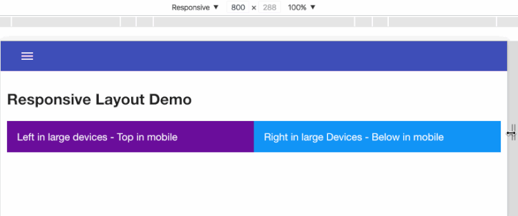
The Layout
When I started using Angular Material, one of the first aspects that I reviewed was the Layout API. This was built on top of CSS3 Flexbox and it is really easy to apply to your HTML content providing all the responsive behavior expected for different screen sizes. We can easily divide our content in rows and/or columns controlling parent containers and children containers as simple as this:
Example 1:
Example 2:
.gif)
This is a great way to organize and create clean and responsive content and at the same time, provide some layer of separation of concerns by using attributes to define our layout and classes to define any desired styling for our application. Remember, this is just tip of the iceberg, there are a lot more attributes you can use to achieve different scenarios.
Some Directives
This is my favorite core feature of the Angular Material framework since it provides such a great library of defined directives, which you can easily use to create modern and beautiful UIs. The best part is these components already follow the Material Design specifications which makes everything so straight forward and easy.
Buttons
It is very common to find buttons in any application, so let's start with that component:
As simple as that. You define a material button with all the animations integrated on the component. You can also apply some defined classes to it, one of them is “md-primary” which works directly with any theme you have defined in your current application, or the “md-raised” class to create a raised button.
.gif)
Side Nav
If you liked the simplicity of working with buttons then you are going to love this component. It is so simple to extend it's functionality and provides a beautiful and elegant way to display a menu in your application.
.gif)
HTML
Javascript
Very simple structure on the HTML side and a simple implementation using a controller to make the menu appear when we click a button.
Datepicker
And just to close our demo section, for this part, a date-picker.
.gif)
We just went through a couple of examples, and saw some of the potential that Angular Material offers the developer with all those beautiful components, easy to extend and just waiting for you to feed it with some data and provide it with the functionality desired for your application.
Bringing some color to your app
Here is where the Theme approach takes place. However, be careful with this since you can end up trapped here, immersed in the amazing palette of colors that Angular Material has ready for you. Believe me, you are going to be so fascinated with so many possible combinations that you will want to select more than one set to provide different themes for your application.
For themes we use the theming provider service ($mdThemingProvider) and we can easily configure this to follow Material Design specifications
If you want to take full advantage of the color palette then you can specify your selection even further by defining some hues in your palette and passing an object next to defined color in the library, just as follows:
To apply your theme to your components just set the class to your definition in the configuration like this:
There is more you can achieve with theming, like setting dark themes so that the theme provider uses the dark hues of the palette, thus defining your custom palette.
Final words
Angular Material is definitely worth the try and could definitely save you time on the development of your UI.
All components are well documented in the Angular Material site. There are a lot of options you can apply to each of them. In the end it is up to you how to exploit the potential of those components based on your needs for your application, but at least you can count on an amazing tool like Angular Material to provide your applications with all the beauty that Material Design brings to the UI world.
.png)